Devlog #21 - Convention(s), Backgrounds, and More Phone Functionality
Hey hi, there's some exciting news in this devlog so let's get started!
First off something big:
We are happy to announce that we will be exhibitors at the German Dev Days!
It's a fairly young convention that has only been held two times so far and after applying for an exhibitor spot with Defaction, we got the opportunity to showcase the demo of the game this May.
This is also the main reason why we had to prioritize Defaction for now, since we need the finished and polished demo for the event.
The convention takes place on May 23rd and May 24th and the demo we will show there is also the demo that we will release a few days later on itch.io.
This leaves us with slightly less than three weeks so things will get busy over the next time.
Other than that we recently attended a business and marketing focused conference, but this time as visitors. Since we're getting closer (and more serious) about establishing Boy Laugh + as an actual studio we felt that this was a good opportunity to learn more about the subject matter, and there sure was a lot of input we got there!
Dev - eZombo
And now to some programming things!

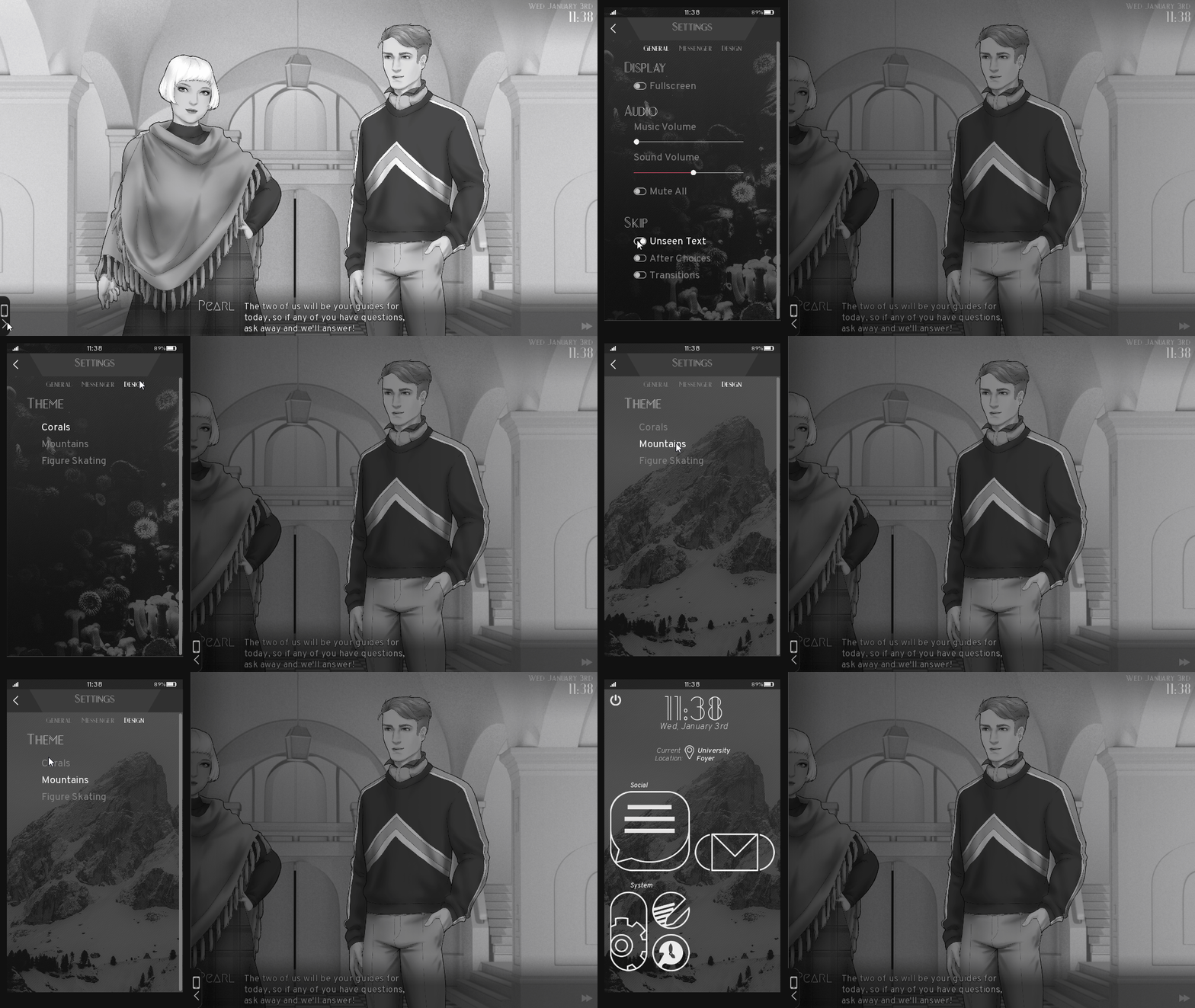
Since the messenger was mostly done at the time of the last devlog, I started working on more features of the phone in general.
I implemented the Email system, which ended up being like a somewhat simpler version of the message system behind the scenes but setting up the screens to display all the content still took some effort.
Here is what it currently looks like but the design might still change a little until the full game is done:


Other than that I also started to implement a system for app specific settings. It's still a work in progress and just a fairly basic pop-up but once it's fully implemented it should make a few things more convenient and also make the phone a bit more realistic.

Speaking of pop-ups, if you want to quit the game or go back to the menu, the power button in the top left of the phone is your friend (and also finally fully implemented!)

Expanding the general settings of the phone menu was another task on my to-do list so now there is functionality for a customized avatar for Coral, different ringtones and contact specific ringtones so you never miss that one message from your fav~
The design will most likely change a bit since my main focus right now was implementing the basic menu and the logic behind it.

If you follow us on Twitter you also may have seen this gif showing another part of the phone customization, which is different themes (or as it is right now: backgrounds).

And last but not least, here is something we haven't really shown so far (except in slight development mishaps), but we are using a special camera system to make things a bit more dynamic and to give the scenes more depth.
Here's a gif showing it in action!

Art - PECTIN
My greatest battle in the last weeks was finishing my first background artwork for Defaction - the ### University's foyer!
Last September, for Devlog #7, I've written about creating backgrounds for //TODO: today and how background art was not "my thing". Also about how to create environments despite it all. WELL. Fast forward seven months and I'm t̶h̶e̶ ̶m̶a̶s̶t̶e̶r̶ ̶o̶f̶ ̶p̶e̶r̶s̶p̶e̶c̶t̶i̶v̶e̶,̶ ̶e̶m̶o̶t̶i̶o̶n̶a̶l̶ ̶l̶i̶g̶h̶t̶i̶n̶g̶,̶ ̶r̶e̶a̶l̶i̶s̶t̶i̶c̶ ̶b̶a̶c̶k̶g̶r̶o̶u̶n̶d̶ ̶d̶e̶t̶a̶i̶l̶s̶ ̶a̶n̶d̶ ̶h̶a̶n̶d̶s̶ ̶t̶o̶o̶!̶ ̶ humbly trying my best at creating art that isn't purely consisting of characters. In the following text I will reveal my work flow for the foyer and most likely the formula I'll apply to future Defaction backgrounds as well.
Like most creative things the first step is to find inspiration - input for the output. We decided to go with Gründerzeit inspired architecture for the main part of the university. eZombo and I searched the internet and we visited a few places with interesting architecture. In the end I chose to reference a familiar place, maybe some of you know the the Hessische Landesmuseum in Darmstadt? It's beautiful. It's foyer is beautiful too.
It turned to be my main reference. The concept sketch roughly established the composition and perspective and the museum's foyer was reduced to what we actually needed in the background to convey a certain feeling.

That was the preparation and the first step in creating the actual artwork. I didn't care much about perspective lines because eZombo would take my sketch and block it out in 3D. Like this we could quickly create a light setup and three-dimensionality that would come closer to realism. For extra spaciality the foyer is divided in three layers that would later be animated in the engine!

I then painted over it. No magic involved. I tried to paint on as few layers as possible in Clip Studio Paint. I began sketching the parts I wanted to paint out and then just went over it again in detail. But pretty early in the process I already decided to push contrasts within the value range I could use. Accordingly I created a few layers on top to emphasize lighter and darker areas. This helped me to find a general mood for the background before I developed it further.

In order to not strain my eyes too much I turned off the visibility of these layers though and just switched them on and off when I needed to check how the foyer would look in its entirety. The next level of "completeness" then was to finish the major parts of the foyer that needed to be painted. The floor tiles were tricky but gladly CSP has perspective rulers, guidelines AND the rectangle selection tool that would adapt to them.

The last phase was relatively short but it was the 20% that polished the 80% of work done on it altogether. Here I added additional details: the reflection on the floor, signs hanging and standing in the hall as well as mooore liiight!°˖ ✧
Some details:


The reflection on the floor isn't very apparent but it's important to make the hall feel more realistic. To emulate the look of a polished but used marble floor I added an effect to the reflection, which in itself is just a slightly edited and mirrored copy of everything above the floor. In CSP you would find the effect in the menu bar. Go to Filter > Transform > Wave. Here is how it looks like:


And yeah, if you're in need of poop shapes made out of triangles, I've got you covered! (ノ~o~)ノ
Well and that's it for this week.
As always, thanks for reading! We'll be back again in two weeks with another devlog.
Get Defaction
Defaction
A narrative game about societal expectations and (not) fitting in
| Status | Prototype |
| Authors | Boys Laugh +, eZombo, Pectin |
| Genre | Visual Novel, Adventure |
| Tags | 2D, Black and White, LGBT, Meaningful Choices, Multiple Endings, Nonlinear, Ren'Py, Singleplayer, Story Rich |
| Languages | English |
More posts
- Defaction Development PauseJul 03, 2019
- Defaction Prologue Version 1.1 Release NotesJan 05, 2019
- Devlog #26 - Post Release and the Near FutureJul 11, 2018
- Defaction Demo Release (It's finally here!)Jul 03, 2018
- Devlog #25 - Working Towards the Demo ReleaseJun 27, 2018
- Devlog # 24 - More Art and Exciting News!Jun 13, 2018
- Devlog #23 - GDD Recap and Demo UpdatesMay 30, 2018
- Devlog #22 - GDD Preparations and Demo NewsMay 16, 2018
- Devlog #20 - Our New Office and First Defaction InsightsApr 18, 2018

Comments
Log in with itch.io to leave a comment.
Hey, first of, congrats on all the exciting things for your studio! So bad I live in France so I obviously won't be able to come, but oh well.
And man, I'm so hyped for this game - it looks so gorgeous and seems so interesting from the few things we can see. I'm still as in love with TODO as I was before, but I think I'm even more excited for this one - BEFORE even playing the demo haha!
Good luck with the preps you need to do for your demo and with that deadline!
Thank you so much!
We're happy to hear that you're excited for Defaction and hope you'll like the demo when we release it publicly!
And thanks for the good luck (。’▽’。)♡