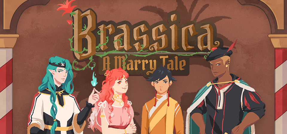
Brassica - A Marry Tale
Devlog #34 - Status Update, Character Design, and UI
Hello! It's time for another update on the development status of Brassica.
After working on separate projects for a while, we are now in the process of getting back on track working on the same game again.
Because of that we're happy to announce that the rest of Brassica's Act 2 will be released in March!
It grew a bit in size from what we originally planned but that just means more game for you~
The exact date will be announced when we can more clearly estimate how long the remaining tasks will take but we're in the process of finishing everything up so it shouldn't be too long.
As for Act 3, our current plan is to release it in April. From now on development should be a lot faster but because we mainly worked on it on the side until now, that is still only a rough estimate. We'll definitely keep you updated on any developments regarding the release dates though!
Well, and that's about it for the status update. Because it's been a while since our devlogs actually described much of our development process (and we haven't shared much about our thought processes behind Brassica), we decided to bring that back with today's devlog.
PECTIN will tell you a bit about Saffron and his design while eZombo describes the development of the UI.
So without further ado, here we go:
Art - PECTIN
Saffron is the curious prince the player takes control of in Brassica. Before I began concepting him Felix and I defined his character. At this point we already knew he would be one of the princes Sappho tricks into going on the journey. (And would then fall in love with another prince because YaoiJam'18). We soon agreed on naming him Saffron. So I already associated the colours of the spice "saffron" with him here.
We also wanted to make him a protagonist with his own personality. Thinking of the player who role-plays him we thought it would be cool to have his character split into three separate personalities he could have:
- the cunning and a bit wild prince
- the typical goody two-shoes type of hero
- and the soft boi who's overwhelmed by the whole predicament and really needs a hug
Another external influence was, my intention to try and fuse traditional things with modern sportswear. Brassica is a fairytale but it's told in a contemporary voice. That's where the idea came from.
...Okay. So I had his name, colours I could associate with him, the three archetypes and my goal to fuse sportswear with traditional clothing. Having all of these "pointers" I began looking for reference pictures. I browsed through online stores of popular sports brands to find things that would fit the character. Due to Saffron's character ranging from cute to rather untamed (in the sense that he would climb a tree without hesitation) I thought that wearing shorts would be most suitable and comfy. But for the top and the overall outfit I wanted to let myself get inspired by traditional elements. The name "Saffron" reminded me of the spice and then its use in Indian culture. I never designed a character with Indian influences before and thought researching into that would be interesting. I found a lot of stuff I could translate into the design. Even the leggings Saffron wears were initially inspired by my findings about Indian culture.
Here's a visual breakdown of what inspired what (excuse my scrawly handwriting >-<):

During the process of drawing out his design, as I always do, I thought about how each component of the outfit would "flow". There're lot's of lines and intersections in his outfit that guide the eyes along the his body:

And here is our boy again as a sprite. Not much different right? Here I put one of his hands in his shorts' pocket, because I think it would suit someone who is either unsure and does that or feels liking hiding something.

That's it about Saffron! I could go on about his colours but I'll save that for when I explain the general artstyle of Brassica! :3
UI - eZombo
Because Brassica was planned as an entry for Yaoi Jam 2018, we thought about ways to keep the scope small. One idea we came up with was to reduce the size of the screen that shows backgrounds and characters so producing the art is a bit faster than filling a full HD 16:9 canvas. One inspiration for that was Sticky Zeitgeist by Porpentine & Rook but something like the Undertale console version where the graphics at the border of the screen change based on the in-game location was also something we considered.
When it came to actually planning the screen, Undertale's influence came through again, because the main area of the screen actually has an aspect ratio of 4:3. This obviously leaves a lot of unused screen space but one thing we knew we could definitely use to fill this was the text box. Having it separate from the main screen also made sure that it didn't overlap with the characters or backgrounds so the space that was reserved for that could be used to its full potential.
With two elements already on the screen, we still had the sides to fill with content. Just using graphics as borders definitely was an option but because Brassica's story plays out a bit like a road movie, we thought having a map of the game world would definitely add to the feeling of that. And to make the UI visually more balanced again, the last bit of free space was then filled with some information on the time of day and how many days were left for the quest of the princes which basically added all the important context for what is going on in the center of the screen.

A first mock-up of the UI featuring a familiar face and St. Bernard...
Around that time, we also developed the idea of presenting the whole game screen like a paper or puppet theater. This seemed like a good way to bring all these different elements together while still supporting the colorful fantasy-ish look of the game art.
I did a quick sketch of how this could look, which turned the mock-up into this:

Aside from adding some more purely graphical elements, I adjusted the text box and the flag that showed the name of the character that is currently speaking.
The map was graphical now instead of just a list (which would have given away future locations) and I was overall fairly happy with the direction the UI was going in.
A few of the border elements overlapped with the main screen now but I tried to make sure it only happens in areas where we wouldn't put any focus.
After getting some feedback from PECTIN I then went on to work on the final lineart while also trying to simplify all the shapes. By then, the characters were also being concepted so instead of Luke I could put Ode into the mock-up (along with a reference for a possible background style).

As you can see, some unnecessary lines, elements, and text were removed to simplify the look of the UI and make sure that the important elements aren't overshadowed by anything else. Overall I tried to keep the lines clean without making them look overly sterile, so any round shapes are generally drawn freehand instead of using any vector shapes. Except for the compass, moon, and their enclosing arcs. Those just looked sloppy when they weren't exact. Not using fixed line widths was another way to make the lines more organic even when they were perfectly straight.
The idea to use different colored flags for each character also came into play now, although Ode's color here is actually used by Hans now…


Colors were next on the agenda. First a basic pass, followed by some adjustments and line colors to make the lines fade more into the background. Having the concepts for the three princes was very helpful for this step because it was important that the UI colors fit into the overall color scheme while keeping the focus on the actual game art.
That's why red is only used close to the center and for important UI elements (the current location on the map is also marked in red). The rest of the colors are rather muted and monochrome on purpose with only a little bit of gold to break it up.

Throughout the whole process my main references were old paper theaters but especially during the coloring process I deviated from these references in favor of using colors that would match with most backgrounds.

Once we were happy with the colors, I did a relatively quick shading pass, just adding shadows with a fairly abstract light source to keep most shadows parallel to the lines. I also added some subtle noise to make everything look a bit more organic.
For the most part it still looked too clean though, so PECTIN suggested overlaying the UI with some watercolor textures.

Which lead to this final mock-up and not only solved the problem but also gave the UI a more painterly look that didn't interfere as much with the general artstyle.
Well, but as always, there are still a few things that changed on the way into the engine.

The map was obviously added (which could probably fill a devlog by itself), the text on the side was changed to better reflect the current quest of the princes (although the other sign may or may not return in future acts...), I added a CTC icon and updated the quick menu (although I can't remember why "Load" was removed so maybe that will return again), but most importantly:
The text box was reduced from three to two lines of text. This wasn't as much an active decision as it was caused by the fact that small line spacing in Ren'Py cuts of parts of some letters until all lines of text are displayed. There are some games that still do this but personally I don't really like how it looks while the text appears. Increasing the textbox would have caused a lot of work because I would have had to shift around more elements of the UI to keep a balanced layout so it was simply easier to remove a line of text and increase the line spacing.
This had a pretty strong effect on the writing because sentences have to be fairly short now or if that doesn't work, broken up into multiple lines.
Even if it wasn't exactly planned, it still influenced the writing style of Brassica and further distinguished it from our other games (although there's more to say on that one) and in hindsight, only two lines of text also look a lot cleaner in this layout.
I could go on about the actual implementation of the UI but this has already been a pretty lengthy post so maybe I'll save it for another devlog.
But that's it for now! We'll be back in two weeks with some more development insights and our current status. We also plan to start posting these devlogs regularly again, so stay tuned for that!
As always, thank you so much for reading and we hope you could find a few things of interest in this devlog.
Leave a comment
Log in with itch.io to leave a comment.