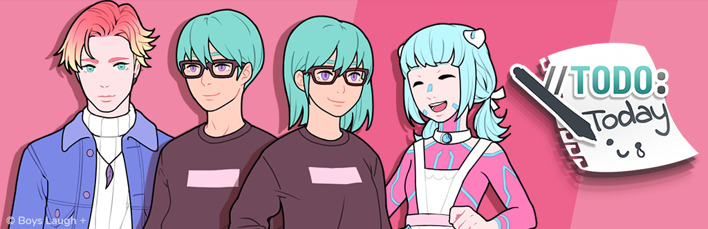
//TODO: today
Devlog #8 - UI Design
Devlog #8 - UI Design
Hey everyone,
first of all thank you for the great response to the update last week which finally pushed us over 4000 downloads for //TODO: today!
We're back with another devlog, this time about our UI!
I'll mainly focus on the in-game UI. You can probably also say a thing or two about the menus as well but since it's not the part of the UI you look at for pretty much the entirety of the game, I'll maybe come back to it some other time.
The UI was basically the first thing I worked on once NaNoRenO started. Writing was important but the UI frames all of the text so knowing how it will look in the end seemed even more important.

The image above is the first mock-up I did (and we're happy that Snow actually made it into the game!).
As you can see it's similar to the end result but also has a bunch of issues. It's bulky, wastes a lot of space, and the date and mood UI make it fairly unbalanced.
Without the mood UI this design could have maybe worked, but it was a fairly important part of our concept (especially because we initially planned to make Teal's mood more central to everything and give it more consequences, but the feature turned out a little too ambitious for a game jam).
And since the whole plot revolved around the fact that you only have one month to fix everything that is currently going wrong with Teal's life, we couldn't just get rid of the date either since it's a fairly important point of reference for the player.
I personally like simplistic and rather sleek designs which is usually a bad reason to decide on a style but in this case it fit into our general concept. We wanted the art to be cute and felt like going for the same look with the UI could be too much, making things cluttered and less readable. And since the mood UI was connected to Joyce's functionality it made sense that the in-game UI should be more closely connected to Bell Tech stylistically (even if you don't really see much of their design in-game).
After talking it through and looking at all the good and bad aspects of the mock-up, I did another iteration which is a lot closer to the final UI.

As you can see, I scaled down the text box, put the date in the upper left corner, and added some additional detail to give everything a bit more personality and make it feel less cold.
The emotions popping up at various points during the game were already planned in the first mock-up but after realizing that it's really hard to read we adjusted them a bit more with the help of colors and Photoshop layer styles.
It can still be a bit hard to read depending on the background but eventually I had to move on since the best UI means nothing if there isn't any content in the game.
With the mood-meter itself I tried to make it as simple as possible without losing readability. The shapes are pretty straightforward and follow the general design language of the UI. I didn't want to include any text so close to the text box since it would only distract from the actual content but with the amount of triangles, the color, and the stylized face icon there were probably enough indicators to communicate which mood is good and which isn't.
There were still a few smaller changes during and after implementation but for the most part the design stayed the same.

Another element that basically bridges the gap between UI and art are the banners you occasionally see in the game.
They were originally born out of a necessity to show that Joyce is displayed on Teal's computer without having to create a completely new background.
Initially we also planned to use the same technique to show sub-locations, partly to reuse the concept of the banners and partly to reduce the art workload. It just so happened that we didn't have any other important sub-locations...
Instead we ended up using the banners as small versions of CGs to put emphasis on special moments (like getting the flyer from Zen) that aren't long enough to justify a full-screen CG.
This way the flow of the game isn't interrupted and it's also less work to make an artwork that is only 400 pixels high than one that's full HD, so we kind of stumbled into a win-win situation!
And that's basically all the important parts of our in-game UI.
As always, I hope you found this devlog interesting and we'll be back next week with another post!
Leave a comment
Log in with itch.io to leave a comment.