Devlog #7 - How a Character Artist does Backgrounds
Devlog #7 - How a Character Artist does Backgrounds
Hi hi! ~☆ Right at this moment I'm working on a few art assets that would complete the first half of //TODO: today.
And the biggest ones that keep me most busy are backgrounds. Because,
honestly, I have never considered myself an artist capable of creating
environments. I have always preferred characters over environments but
here I am and I want to share with you my personal approach on drawing
backgrounds.
Sooo backgrounds aren't “my thing”. The thought of beginning and actually finishing a picture that captures a whole sight intimidates me.
And, yup, I've finished some for //TODO: today and Teach Me Onegai~! by now but these didn't completely solve my long nursed fear of them.
In order to silence this anxiety I try to think on a smaller scale. I can draw a cup, a table, a chair and even a window. If I put them on a canvas using the right angles – that's a furnished room right? So an environment is just a collection of small things I hopefully can draw. If there are objects I have never drawn before or have never seen in real life, things take a bit longer, because I need to find good reference pictures and time to understand the shape and function of the objects.
And here we come to my first phase of creating something for a project: preparation phase. I need to understand what kind of background I'm drawing. Some of the questions I then ask myself are:
1. What is it used for?
2. In what situations does the player see it?
3. What meaning would I give it?
And in case of the book store interior the answers would be like this:
1. To show the inside of a book store Ms. Cardhover manages and the place Teal and Phoenix work at.
2. The player sees it mostly during Teal's part-time job.
3. It's a small store that is dear to Ms. Cardhover so there should be elements that show her care for and relation to it.
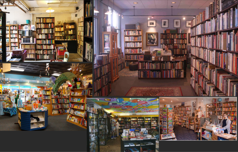
With these mental notes in my head I begin searching the internet for reference pictures with elements I think would suit the image I want to create. I also collect colours for a colour palette I use for reference too. The colours depend on the time of day and theme I want to push.

Afterwards
I roughly sketch out some general ideas. I find it important to
consider the position of the player to determine what kind of view point
to chose for the picture. The player sees the background from Teal's
perspective. Therefore I put the horizon line on eye-level which is
about the middle of the picture. This differs depending on what the
focus of the picture will be. The horizon line is the first thing I
establish before drawing anything else. Because it's easy and setting
the vanishing point depends on it.

I
then do a more definite sketch above the original sketch layer. Here I
decide on the details of the picture, like which specific objects to
place. A huge help to make this fun for me is thinking about bits of
stories involving the place. Like people having conversations over
something or a messy table its owner just worked at it.

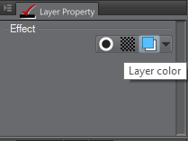
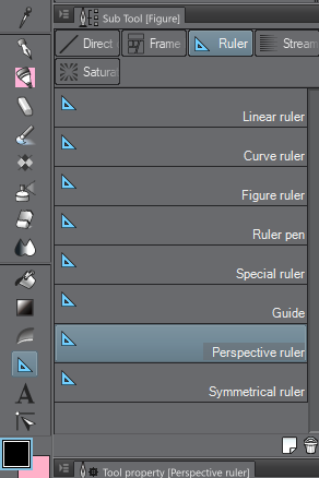
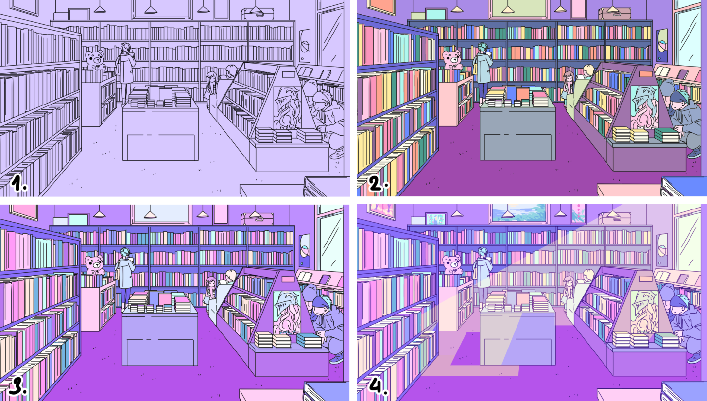
When I'm satisfied with what I have, I do the clean line work on top of these layers. I just love the “Layer Color” function in CSP. It's a quick way to give the sketch lines a more subtle appearance so focussing on the final black line-outs would be easier. In Photoshop I would lock the transparency of the sketch layer and colour them. At this point I also like to use Clip Studio Paint's “ruler” tools to create guide lines but I'm still trying to figure them out.

When the lines are done I roughly colour everything using the bucket tool. Here I chose the colours depending on what would suit the object, would look nice in relation to the objects adjacent to it and the overall colour scheme of the picture. Ms Cardhover's main colour is purple!゚✧

The final steps are a mixed set of things I do at the same time. I:correct mistakes in the lines and colouring
- adjust the colours of individual objects
- have a layer folder with the UI and character sprites to switch on to see if the characters look good on in front of the background
- add colour layers on top with different layer styles (“overlay” is my favourite)
And when I feel the picture is good enough to be called complete, I declare it done and be happy. ヽ(*´∀`)ノ
Hope this helped somehow! And I'm so excited for the complete first part of //TODO: today coming out on the 8th September. AH. I will now continue my drawings, bye~!!
Get //TODO: today
//TODO: today
A visual novel about figuring out life with the help of an AI
| Status | Released |
| Authors | Boys Laugh +, eZombo, Pectin |
| Genre | Visual Novel, Adventure |
| Tags | Colorful, Cute, Dating Sim, LGBT, Multiple Endings, Ren'Py |
| Languages | English |
More posts
- //TODO: today - Version 2.2 ReleaseJun 03, 2021
- //TODO: today - Version 2.1 ReleaseMar 06, 2020
- //TODO: today Special Edition Zine ReleaseOct 03, 2019
- //TODO: today - Version 2.0 Release!Sep 27, 2019
- Devlog #45 - Special Edition Release Date + Current PlansSep 17, 2019
- Devlog #44 - Soundtrack Development: Themes Pt. 1Jul 26, 2019
- Devlog #43 - Phoenix's Art Pt. 1 - A Character? Right Away!Jul 20, 2019
- Devlog #42 - Status Update & Music PlanningJul 12, 2019
- Devlog #41 - A Colourful JourneyJun 29, 2019
- Devlog #40 - Writing Structure in DetailJun 21, 2019

Leave a comment
Log in with itch.io to leave a comment.