//TODO: today
Devlog #9 - UI Design Part Two
Devlog #9 - UI Design Part Two
Hey everyone,
we originally wanted to post another character design devlog today but unfortunately it didn't quite work out with our schedules.
So I'll bridge the gap with another post about our UI!
If you read our previous devlog you know that the in-game UI was made first.
A short while after, since we wanted to make a thread about our game on the Lemma Soft Forums, we decided to work on our logo.
And that's basically where the divide in our UI design happened.
Making the logo sharp, angular, and minimalistic just didn't fit the image we had of the game as a whole, so instead of leaning on the Bell Tech design we decided to base the rest of the UI design on Teal.

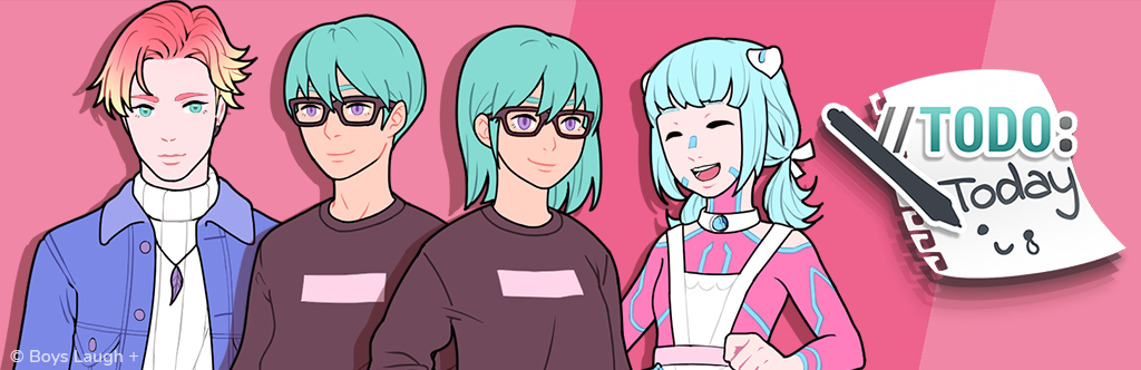
A piece of paper seemed pretty obvious for a to-do list and even if the "//TODO:" part of the title is based on comments you may find in source code that still has room for improvements, we wanted to give the rest of the design a more handwritten look.
The tablet pen of course stands for Teal's aspirations to be an artist and having the combination of the more "techy" and the more analog design elements made for a fairly nice visual representation of the whole AI/Escapism/Real-Life Problem combination found throughout the game.
We wanted the game as a whole to be rather light hearted, so we included the little smiley but given that it also deals with Teal's depression and other topics that aren't exactly light hearted, we also added a tear. It also seemed pretty in-character for Teal to draw it like that on a to-do list that only says "today"...

The other menus were then based on the logo design. The doodles were made from Teal's perspective, or within the menus they became a further identifier of what everything was about.
All in all I tried to find a balance between artificial and organic that fit with the rest of the game but wasn't too geometric to lose character.

Because most parts of this UI were supposed to look hand-written, it also doesn't follow any strict grids. Everything is basically just arranged in a way so all the content fits on a page. There are a lot of irregularities and most of the time arrangement and spacing were eyeballed instead of constructing it beforehand in Photoshop or Illustrator like you would do with most other designs.
Working on it so organically also fit pretty well with our original game jam schedule although ultimately the UI has been updated quite a lot compared to what we originally released back in April.
And I think this is about everything important there is to say about the UI!
Even if this devlog was a little shorter than usual I hope it was still interesting and we'll come back to that character design devlog probably next week!
Thanks for reading!
Leave a comment
Log in with itch.io to leave a comment.